Written By Christina Rodriguez
Trends are ephemeral and yet when they are good, they keep coming back every few decades or so. That is what we see in the interior design and fashion world. Repeating what was popular in more modern and updated iterations for new eyes. Lately we have seen that Mid Century Modern, gray and neutral colors, plus gold and brass have been very popular again. These trends are still going strong, but now that we are coming to the end of this decade, other trends are starting to emerge.
Let’s begin with color. Gray has been a staple of the design world for ten years or more. Gray was seemingly the answer to a general world view that was drawing in on itself and asking for comfort and a safe space to return to. It’s not going anywhere, but deeper and brighter colors are becoming more and more popular. One of the reasons for this is that we as a society are becoming more optimistic as the recession has faded in our collective memory.
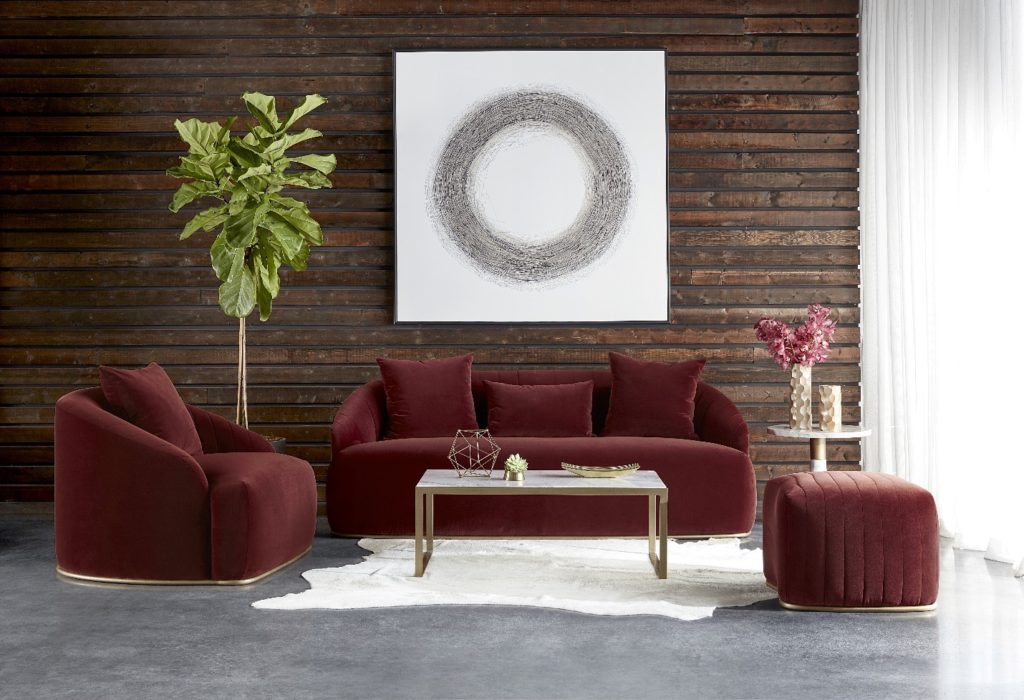
The colors that blend well with gray have been muted and soft, but with optimism comes deeper and bolder color such as coral, mauve, and deep green. This isn’t the pink and green that was popular in the 1980’s, but jewel tones. Think emeralds and the deep shades of an evergreen forest or even the shadowy spaces of the rain forest where animals hide. The coral is also a deeper shade like the flowers that grow in the jungle. More tropical in nature and less pastel. Mauve is less pink and closer to maroon. If you want to pair these with gray , you can: choose charcoal gray for a moody feel, but add lighter tones of wood to keep your space from feeling too dark and dim. Even better, choose these colors in velvet fabrics for a luxurious feel.
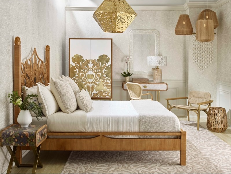
Bent wood, caning, and woods stained in natural, lighter colors are what to look for when adding pieces to your décor. This is another trend that is showing up more and more. Dark wood tones will always be a classic and will never truly go out of style, however the lighter woods speak to that feeling of optimism and satisfaction that is happening around us. Along with the lighter wood tones comes prints. Geometrics reminiscent of Art Deco and Tribal prints are coming back into style now. These add to the natural, or eco-friendly and sustainable, feel that is resonating in our society these days. We are happier, and yet we are realizing that the excess of earlier decades can be “reduced, re-used, and recycled” in our homes for a more eclectic and world-traveled look and feel.
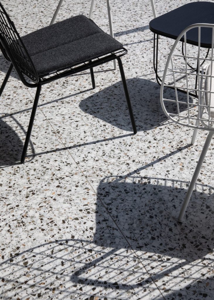
Speaking of Art Deco, terrazzo is coming back. Not only for flooring, but tabletops, counter tops, tile, and more. Think the Hoover Dam, which is covered in terrazzo and was built during the height of the Art Deco period. Terrazzo is marble chips embedded in concrete and is very durable as anyone who has visited the dam can see more than 80 years later. Colorful and versatile, terrazzo is a classic material that can be used with any design style popular today.
With all the building going on around us here in the Rio Grande Valley, you may have noticed the unique and interesting ceiling treatments that builders have been incorporating into their houses. Various designs are created using three dimensional soffits that project from the flat ceiling. While almost any shape can be created, color can be used to enhance them. You don’t have to paint them white!
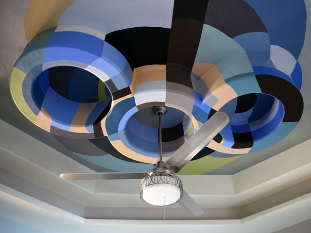
This brings us to another trend that is becoming more and more popular. Wallpaper and deep jewel tones colors are being used to enhance the “fifth wall” in homes today. Let your creativity loose and highlight those ceilings. An every-day tray ceiling can be updated and turned into a statement with a little color or a bold, graphic wallpaper. There are no rules. You can add these to any room in your home that might be ready for a change from an entry way with a dome ceiling to a bedroom with a raised ceiling. Be bold and have fun with your interior decorating.


