Written By Alma Guerrero Barham
In my professional years of experience I have conducted short courses on visual merchandising, industrial blue print reading, space planning, lighting and interior design. One of the most interesting facets from all those experiences came from the people who attended a talk during one of my six week courses that dealt with interior design. Some of the topics included color coordination, furniture study, space planning and lighting, and international motifs, among other creative concepts.
Early in the course’s duration, I proposed a question to the students. ”If you could make a color choice without any restrictions whatsoever, what color would you choose to paint the walls of your home, and why would that color be your choice? To my disenchantment, the majority of them chose white, beige or oyster color. Next, I asked each student to name their favorite color. None of them stated white, beige or oyster for their answers. After asking why no one had chosen their personal favorite for theoretical use in their own homes, their answers were all basically the same.
1. Fear of the overall effect of the color
2. Fear of other people’s reaction
3. Fear of a spouse’s reaction
Those reactions are good evidence of how some people may be influenced by color. Even though some of us may not be conscious of the influence made upon us in our daily lives, there are three elements that have significant roles in this process. Color, psychology and design all impact our emotions, or reactions to certain situations, and even simply the choices we make regarding our attire, the design of our homes and businesses, our comfort zones, and even the selection of our vehicle’s color. The list is endless.
Sherrill Whitton of Interior Design and Decor shared, the psychology is involved with the eyes’ reactions to the light rays and the transfer of the message to the brain. The sensation occurring in the brain precipitates a mixture of emotional responses. Color activity includes four stages:
1. LIGHT: The source of color.
2. THE OBJECT: For the light rays to act upon.
3. THE EYES: Which receives the reflected light from the object.
4. THE BRAIN: Which interprets this sensation.
How does this information relate to decor and design? Colors have their own characteristics, defined by the length and form of their physical wavelength. For instance:
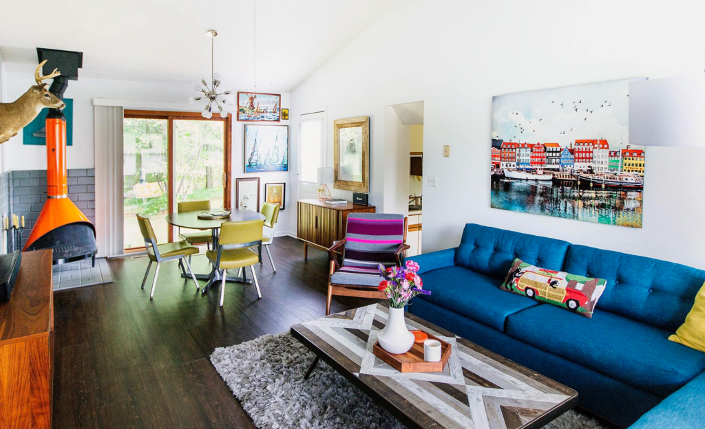
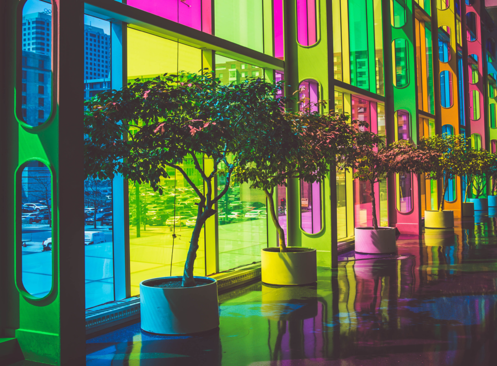
RED denotes warmth, richness and splendor. It is quite atten-tion getting because of its short wavelength that gives a rapid fire effect to the eyes. Red can certainly be dramatic in small quantities, but can create a sensory overload when used in large quantities. If the effect you seek in your designing requires boisterous, high energy, such as for a disco, by all means use lots of red.
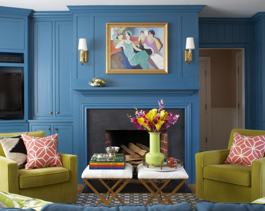
BLUE is considered a cool color on the generally accepted color wheel. It resonates with spaciousness, as in the sky or the ocean. Dark blue is often connected with professionalism. White collar workers are often sporting blue or gray attire.
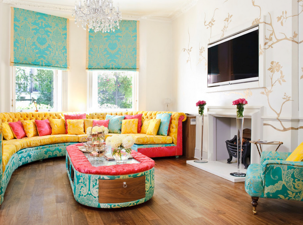
YELLOW, CREME or IVORY represent light, warmth and cheerfulness. They can be safely used in abundance, especially on walls or ceilings and are commonly used in rooms where lighting is poor.
TAN and LIGHT BROWN register as warm and friendly. They are popular colors used in many rooms.
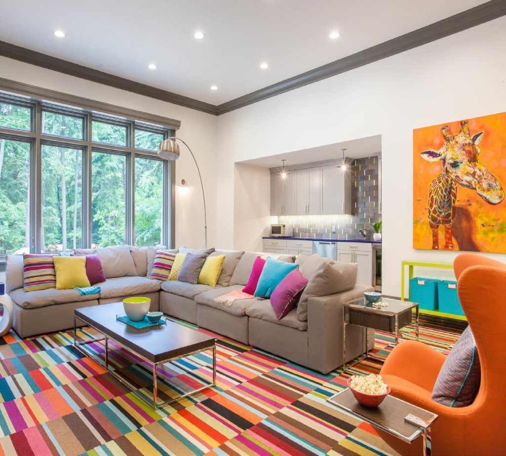
ORANGE represents warmth, light and energy. It can be incredibly decorative in small quantities. Some people believe that it promotes success in general.
GREEN is reminiscent of nature, such as trees, grass, and other plants. It is considered cool, restful, quiet and easy on the eyes, depending on the shade and tint of green that is used.
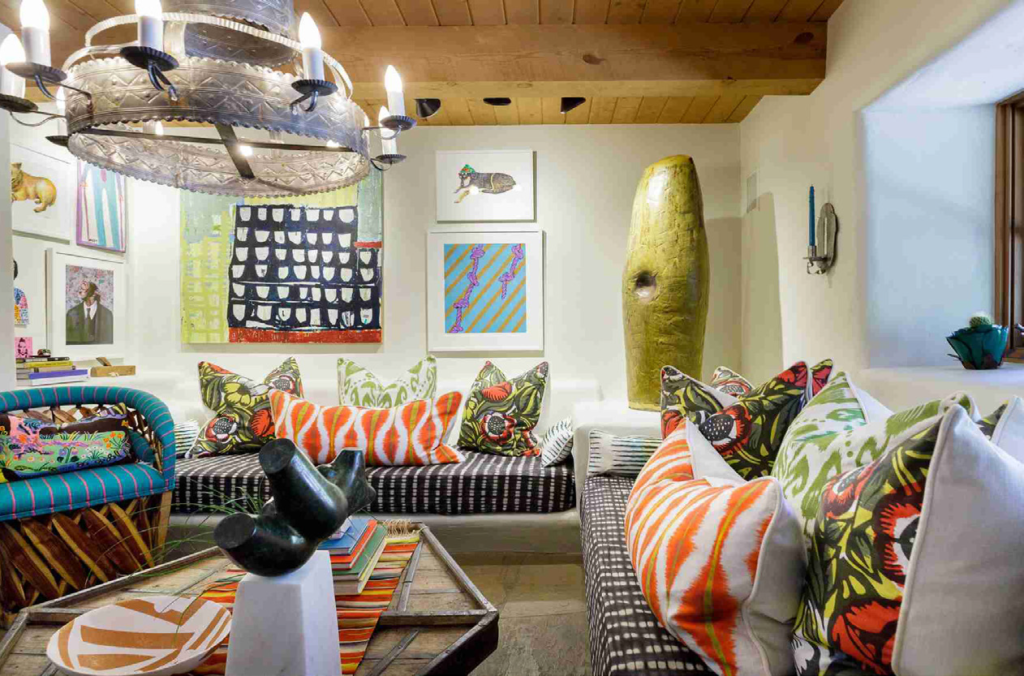
PINK has connotations of animation and daintiness. Many children’s books, cartoons and playrooms incorporate pink in their color schemes, especially hot pink.
PURPLE, PLUM, and LAVENDER are warm colors that are indicative of splendor, royalty and dignity. Persons of royalty such as kings, queens and priests often wear purple, significantly on special occasions. When used in a home, most designers recommend that it is used sparingly. Once again, psychology enters the picture. If your personality embraces the royal colors, go for it bravely, be it in your home, your clothing, or accessories.
BLACK and WHITE are considered neutrals. The use of these two will actually accentuate other colors by way of providing contrast.
GOLD and SILVER represent opulence and their use in decorating and elsewhere will generate a significant amount of attention.
Many homes employ a monochromatic color scheme; which merely means using varying shades of one hue. This will create a flow that is easy on the eyes without jolts of unpredictability to the viewer’s psyche. On the other hand, artists and musicians and many people in the creative fields crave color; they are more adept at using the right side of their brains which has been documented as being where creative thought takes place. People who predominantly use their brains’ left side are more analytical and methodical than their right side dominant counterparts who yearn for the unusual, the unexpected and enjoy “coloring outside the lines .” If your design goal is for decorative accessories to dominate the room, it is best to limit your walls to plainer neutrals. When designing or decorating, keep in mind that the MAIN areas are the floors, walls, and ceilings. Secondary areas consist of window treatments and large upholstered pieces of furniture. Minor areas consist of small chairs, paintings, lamps, pillows and other such accessories.
Embracing color is trendy these days and more homes, businesses, hospitals and clothing designs reflect this shift based on the effect colors have on recipients’ emotional response. Some hospitals are using RED in moderate amounts because it is a passionate and warm color which expresses vitality, energy, and can alleviate depression. The same logic can be applied to that color’s use in homes. If you are comfortable with and used to relying on your phone to help make choices, major paint manufactures now have an app for paint color choice, too. Not everyone has an “artist’s eye” and using an app for that can take some of the anxiety away.
Whether you are re-doing your den or creating another MAR-A-LAGO, remember the three magic words:
COLOR. PSYCHOLOGY. DESIGN.
I rest my case for the Psychology of Color.