A small city apartment is given a contemporary facelift with the clever use of space, strong colors and a touch of minimalism.
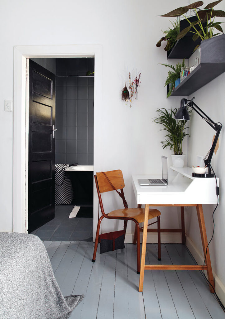
The office nook might be in the bedroom, but it is arranged to create the illusion of being a separate space.
When you put two creative people with big plans in a small space yet to reach its full potential, the result is guaranteed to be interesting. That’s what happened with couple Janine Mollentze and Ruan Vermeulen. They were in the market for a small renovation project, and the one-bedroom dwelling they purchased fit their vision perfectly. Janine works as a production manager and digital content producer, and her keen eye for interiors has prompted many a friend to ask for her help with decorating their homes.
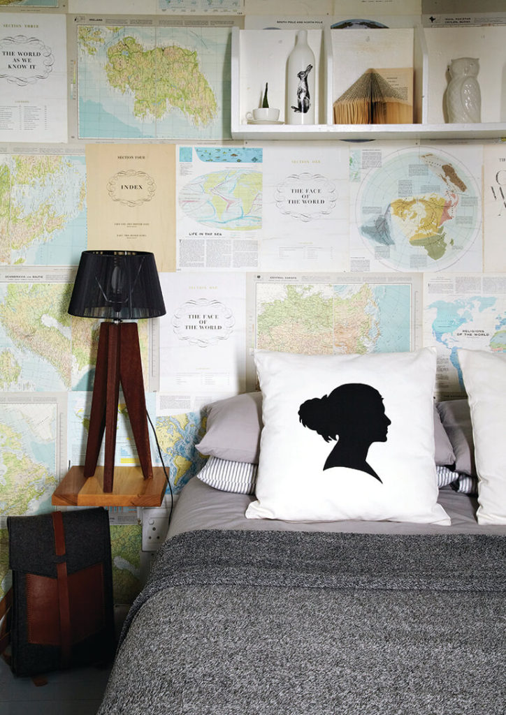
The couple created a feature wall behind the bed by sticking old world-atlas pages to the wall. An old office file cabinet was hung above the bed to create more storage.
The area has a great sense of community, and even though it’s within walking distance to popular restaurants and shops, the suburb is quiet and green with trees. Their old art deco building is on a cul de sac with a cobbled road, and the lush gardens are home to all kinds of animals, including six cats, two ducks and two tortoises. ‘We even have a hadeda ibis staying with us,’ Janine says. ‘He injured his wing and ended up staying for good!’
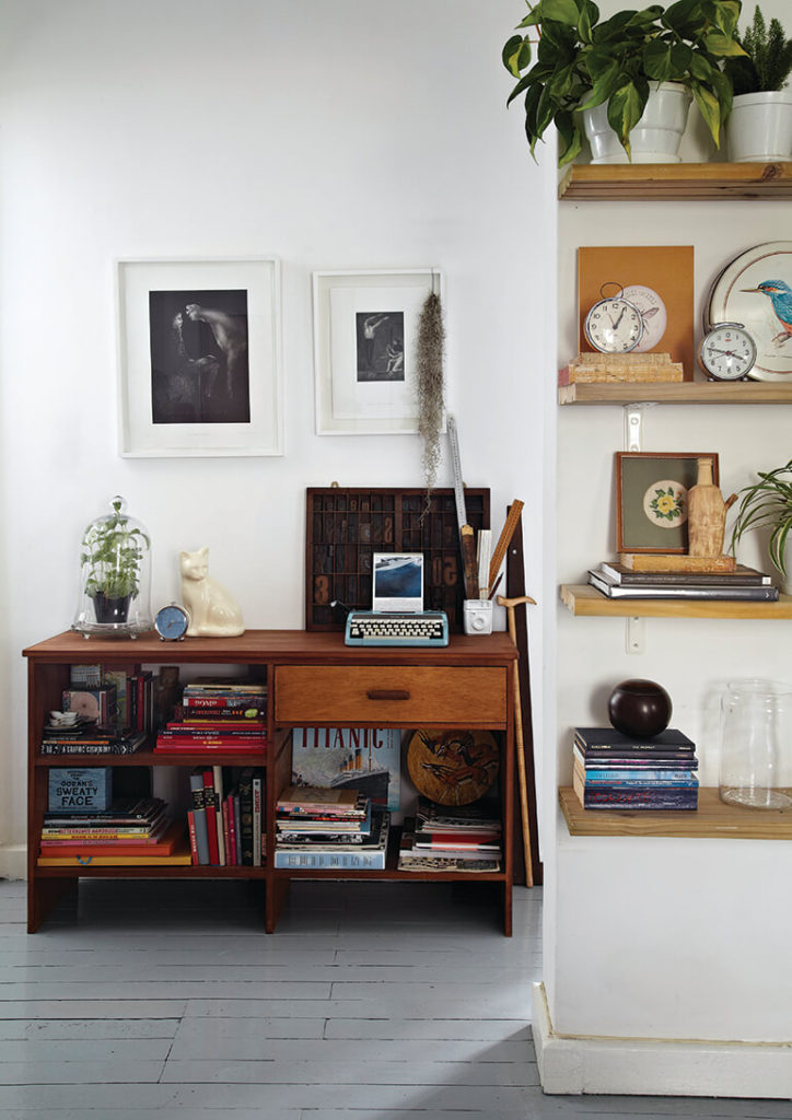
Floating shelves in the lounge and a vintage sideboard are filled with plants in simple white pots and quirky market finds.
In the year and a half, the couple has lived in the flat, they’ve made substantial improvements to what used to be a crowded, limiting space. ‘We moved in with the idea of renovating, but wanted to live here first before deciding on a plan,’ Janine says. ‘We haven’t spent much money in the kitchen, bathroom and bedroom areas, but we will eventually open up the ceiling for a loft conversion.’
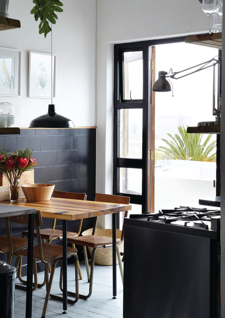
The kitchen may be small, but it can comfortably seat four people at the wooden table. The sterile white tiles were painted black and a gas stove and custom-made shelving were put in for a clean and industrial look.
The couple enjoys cooking and having dinner parties, but the kitchen was the area of biggest concern when they moved in. It had tiled white walls, white cabinets and a big brown kitchen island being utilized as the kitchen sink. ‘It looked terrible,’ Janine says. ‘We didn’t want to spend too much on renovations, but we also didn’t want to compromise on aesthetics.’ The cupboards were all pulled out and the tiles got a slick of matt black paint, with a simple wooden dado rail dividing the walls into a monochrome palette. The couple wanted freestanding kitchen counters with an industrial feel, so had it custom-made by a friend. Wooden shelves were put up to maximize the space, and they decided to stay within a specific color scheme when buying crockery and other kitchen accessories. With its solid poplar wood table and French doors opening up to a small balcony with panoramic views, it is no wonder the kitchen is Janine’s favorite spot in the house.
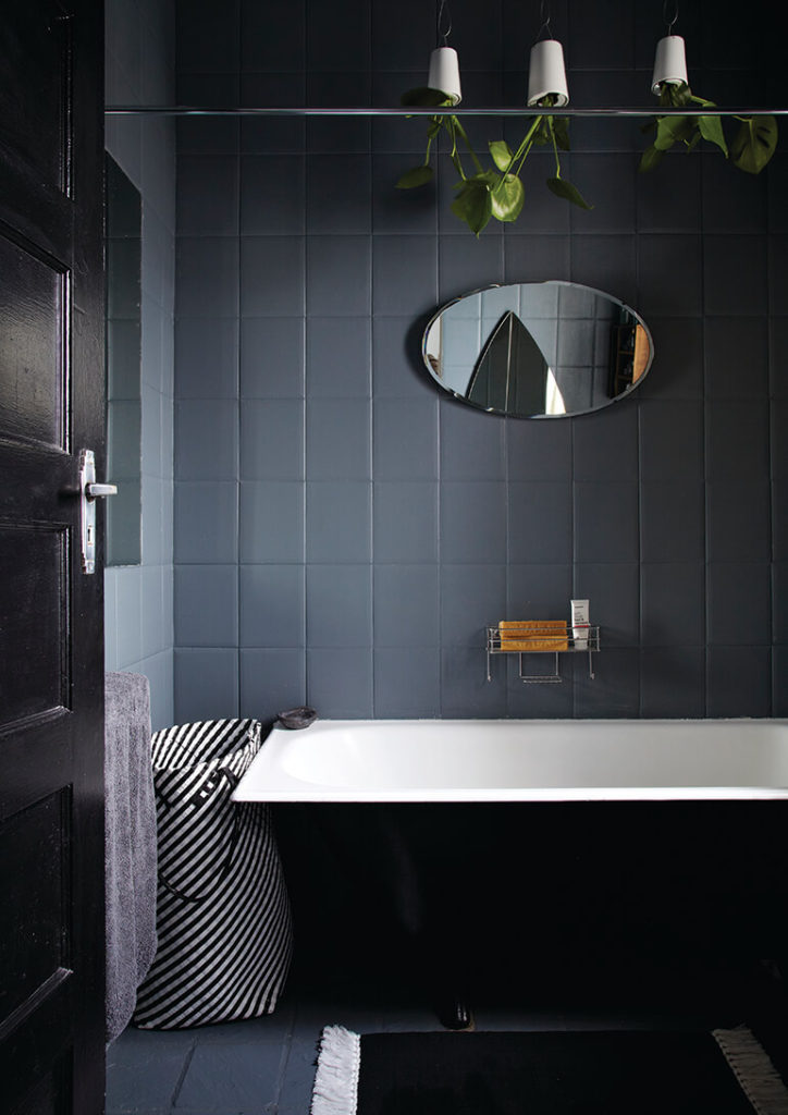
The bathroom was given a stylish makeover by painting the white tiles grey and the bath black. Hanging planters bring in color, and reflecting mirrors make the space appear bigger.
The open-plan living and dining area echoes the monochromatic coloring of the kitchen, with grey and white walls, a light-gray floor and a charcoal corner couch. ‘My decor style can best be described as “Scandi vintage”,’ Janine says. ‘I love Scandinavian interiors, which are warm and unassuming, and by combining contemporary pieces with vintage accessories I get to have that vintage/modern appeal.’ The moody gray wall is the focal point of the room and is filled with artworks, botanical prints, photographs of their travels, and sepia pictures of Janine and Ruan’s grandfathers. The decor was chosen to fit with both the gray painted floors and an eye-catching pair of art deco armchairs, with the sofa an affordable find from a retail chain that fit perfectly with the layout of the room. Similar shelving in the kitchen provides generous space for the couple’s quirky collections of retro desk clocks and typewriters, as well as various pot plants lending pops of green. The room is filled with special pieces, books and images from their travels, with a prized pair of etchings by Ukrainian artist Oleksiy Fedorenko still waiting to be framed. The couple regularly hunts for vintage treasures to add to their collections – ‘any antique market or vintage shop is the death of me,’ Janine says. ‘I can’t walk past without going in, and I can’t leave without buying something!’ The imposing dining room table and imbuia sideboard were inherited from Ruan’s grandfather, and the history of the pieces imbues the dining area with a sense of home and belonging.
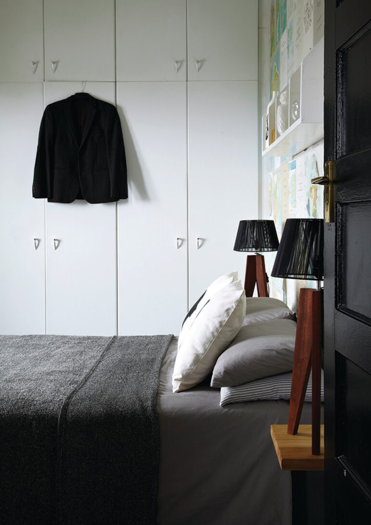
Move to the bedroom and the couple’s clever maximizing of space again becomes evident. The awkward placing of the bathroom entrance hampered plans to make the layout more practical, but by transforming a corner into a small office space, the room becomes multi-functional without looking forced. The desk and shelving repeat the motifs of solid monochrome colors used with wooden accents, with numerous pot plants mirroring the greenery outside the window. The most striking aspect of the bedroom is the papered wall behind the bed, an idea Janine saw on Pinterest. ‘We had to scavenge every second-hand bookshop to find vintage world atlases to use,’ Janine says. The bathroom had similar white tiles to the kitchen, which also swiftly disappeared under a fresh layer of gray paint. The hanging planters above the bath are from an urban gardening company, and installing them was the easiest way to make plants part of the bathroom. Mirrors were strategically placed to give the impression of more space and to add character, like the boat-shaped wall mirror Janine picked up at a vintage market.
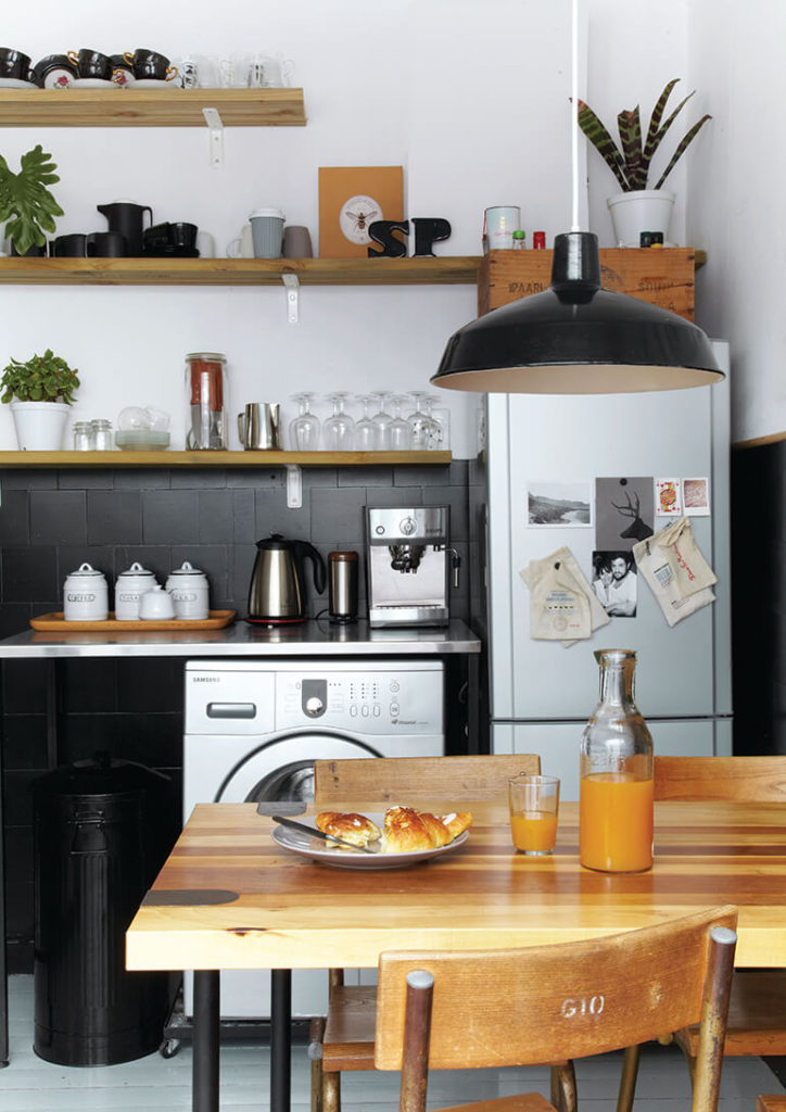
Thriving green pot plants provide the only spots of color in this slick, urban kitchen. Instead of being an eyesore, the industrial black bin blends in with the black wall, becoming a style statement in its own right.
Janine says a compact space needn’t be a design challenge – the secret is in choosing furnishings and decorative elements that offer maximum functionality. ‘When you live in a small space, each room tends to have more than one use. Built-in storage nooks also help you utilize every available corner.’ With plans to open up a loft and add more bedrooms and a bathroom for future little creatives, this unassuming little flat is still full of surprises just waiting to happen.
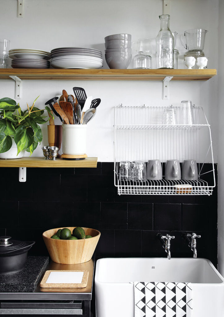
The old kitchen cabinets were torn out and open shelving installed. Janine and Ruan decided to only buy crockery and utensils in certain colors, to ensure the open shelves become a design feature of their own. A wall-mounted dish rack makes the most of the limited space.


