Written By Chris Sias
Photography By Adrian Llaguno
To rise like a phoenix from the ashes means to emerge from a catastrophe stronger, smarter, and better for it. This expression is based on a story that goes back thousands of years. The phoenix is a mythical bird from Greek mythology. It was a feathered creature of great size with talons and wings, its plumage radiant and beautiful. The phoenix lived for 500 years before it built its own funeral pyre, burst into flame, and died, consumed in its own fiery inferno. Soon after, the mythical creature rose out of the ashes, in a transformation from death to life.
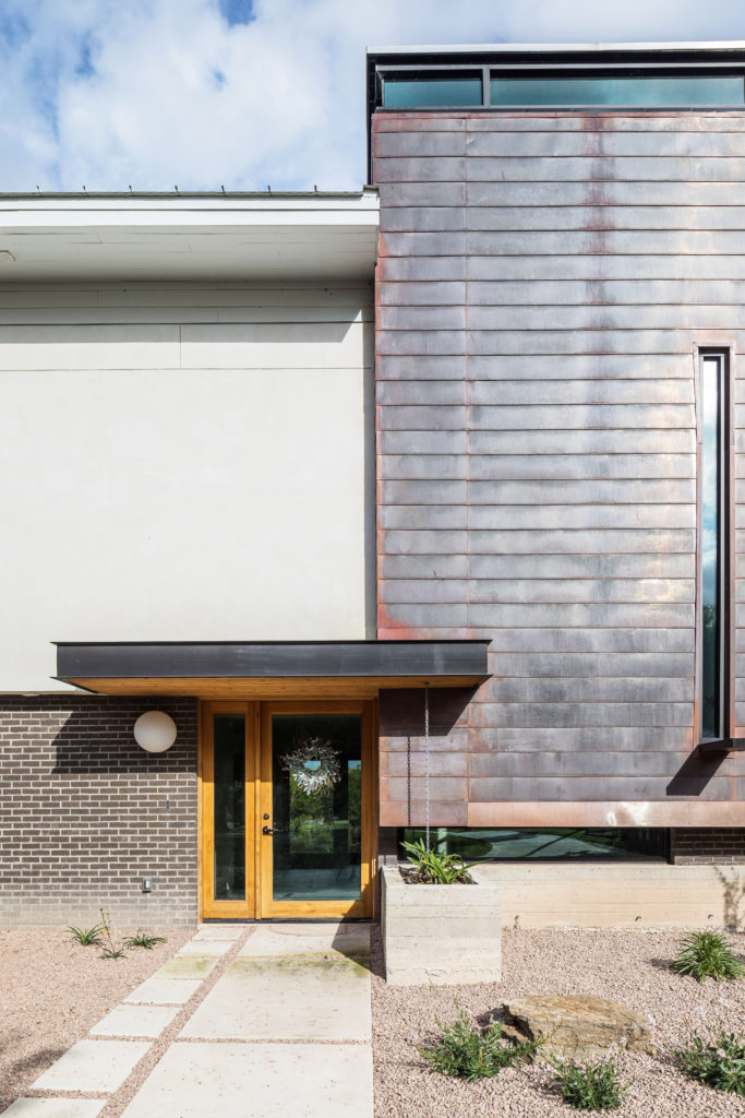
The story of the Phoenix is an appropriate metaphor for this project. After a devastating fire destroyed their previous residence, the owners decided that their new home would rise from the literal ashes of the previous. Not coincidentally, the new structure’s footprint shares much of the footprint of the previous, but that is where the similarities end. The house is situated along an arroyo and as such, every design decision made, takes the water into consideration. The result is a spatial arrangement that takes full advantage of the views of the water. The layout takes a cue from the past and recalls the idea of the “piano nobile” (noble floor) from classical Italian architecture. The piano nobile is the principal floor of a substantial house. It is typically located on what less-noble people (like me), refer to simply, as the second floor. (The classical Italian ground floor was reserved for more utilitarian, service-oriented, purposes and not entertaining).
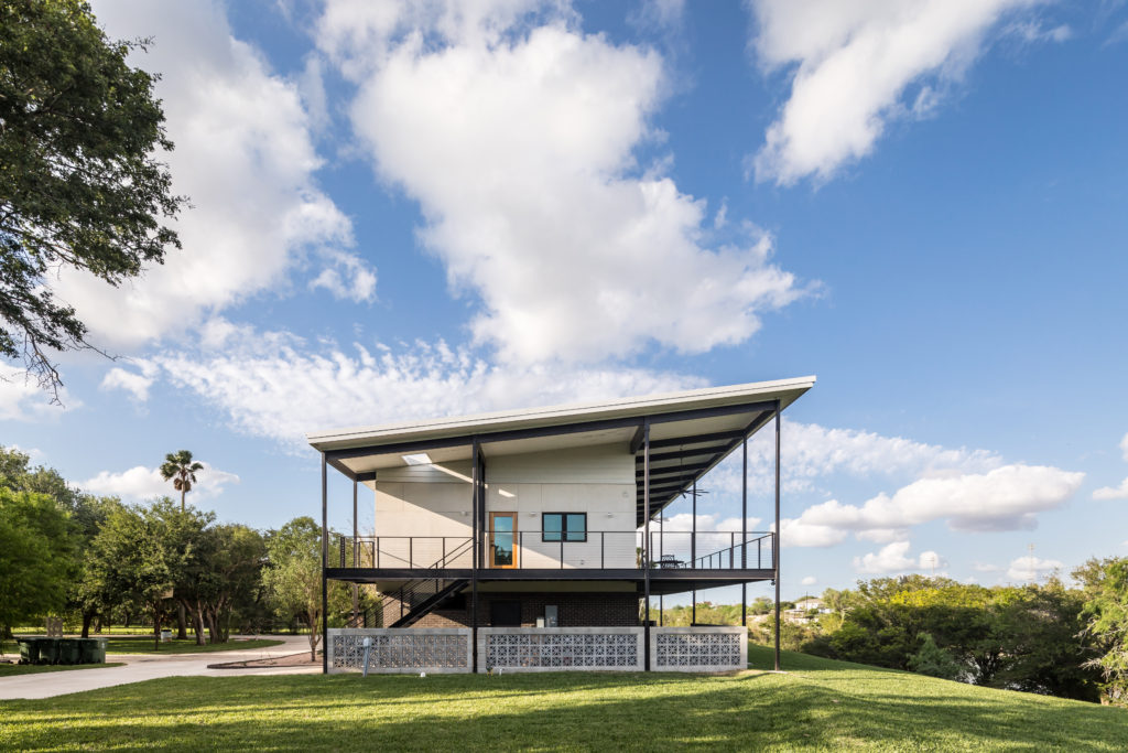
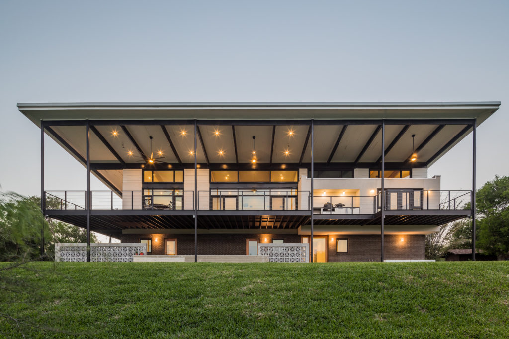
Appropriately, the execution of this home is not a clas-sical architectural revival piece; however, this nod to classical architecture was the single most important design decision and drives the overall form and function of the entire structure. Arranging the primary entertainment and living spaces above the first floor elevates the views above the tree line and gives the house a strong visual connection to the water. The ground level features more of the private and utility spaces such as guest bedrooms, a media room and laundry room. The use of dark clay brick at ground level contrasts the light plaster above, reinforcing the idea of a light upper story with a solid base, and “grounds” the building to the ashes storey from which it came. The floor plan is stretched parallel to the arroyo maximizing opportunities to connect the interior spaces with views of the water.
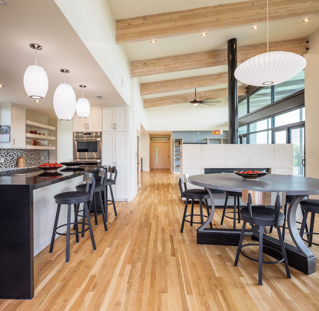
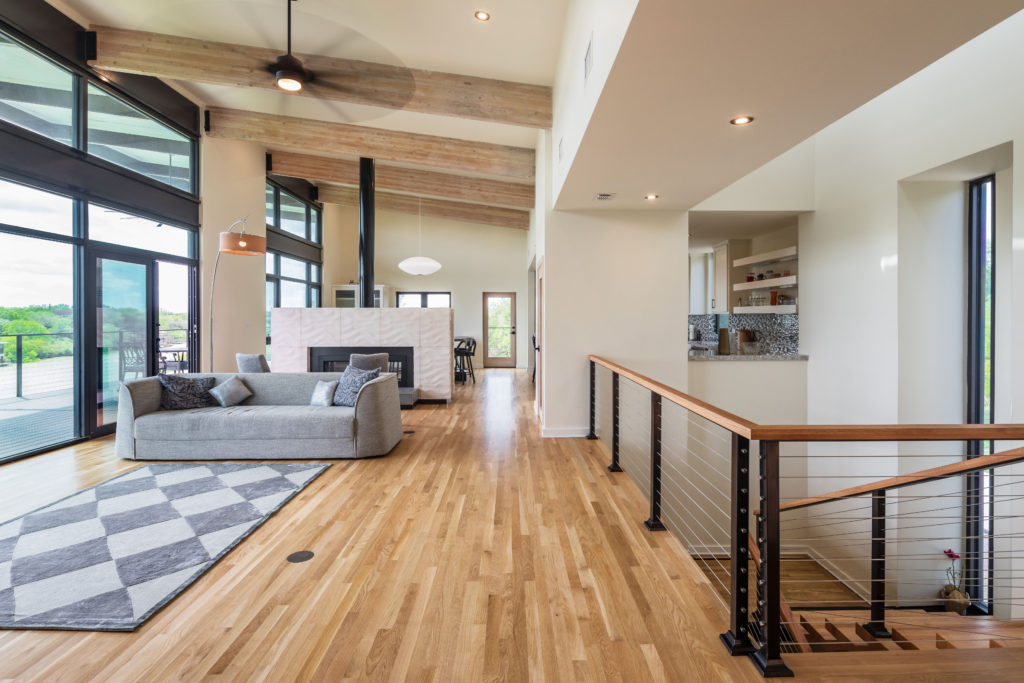
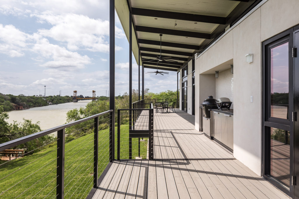
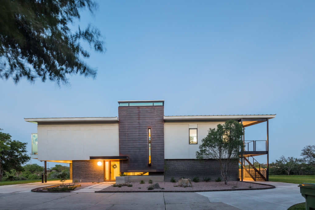
Though classical ideas inspired the spatial arrangement of the home, this piece of architecture is definitely of its time and place. This is a 21st century home, built with 21st century tech-nology, located in the Rio Grande Valley and does not pretend to be anything less. The selection and arrangement of exterior elements is modern yet restrained, and the selection of the finish materials is done with regional considerations such as the hand fabricated copper panels on the main entry façade, and the masonry screen wall along the east side of the house. The copper will be allowed to develop patina naturally over time and will be a testament to its place as it naturally ages along the banks of the arroyo. The masonry screen wall is of a type of masonry construction that pays homage to the regionalism of the Rio Grande Valley. Continuing along the east side, large expanses of glass capture the views and make a strong con-nection to the water and outdoors. The hurricane-rated, and impact resistant glass is shielded from the hot Texas sun by a deep roof overhang.
This overhang defines a wonderful patio space that runs the full width of the house, making the outdoors an accessi-ble and enjoyable space, despite the harsh Texas heat. Along the west façade, windows are purposefully minimized in order to reduce heat gain. Operable windows are arranged in such a way as to capture the prevailing south east breeze. When weather permits, this is a passive way to keep the house’s indoor temperature regulated. The south façade features one of the houses most daring elements. The glass box that dramat-ically cantilevers from the wall is the master shower where one can enjoy “uninhibited” views of the water and surroundings. Thoughtful sandblasting of the glass and the home’s secluded location make such a feature possible, and though it took some convincing to move forward with such a provocative element, it has quickly become one of the owner’s favorite features of the house. A discretely designed solar water heating system provides plenty of hot water for the shower and all plumbing fixtures.
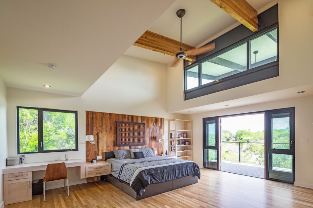
In addition to the solar water heating, other 21st century elements that cannot be seen are a continuous weather barrier membrane, continuous outboard rigid insulation, spray foam insulation, and a roof material with a high reflectivity index. These often overlooked elements, along with the building’s strategic orientation and use of windows, keep the house cool with minimal need for air conditioning. Now that’s modern architecture!
Entering the house is a rich experience. A Japanese influenced rock garden and board formed concrete planter greet guests as they approach the front door. Upon reaching the door, your eye is drawn up a rain chain and to the nicely detailed soffit at the underside of the entry canopy. You notice the faint smell of cedar above and can appreciate the artisan quality of the copper paneling from this vantage point. The sin-gle globe light fixture to the side of the door is an understated touch and works to soften the overall composition of the entry. Lastly, you notice a thin strip of glass that separates the planter from the copper paneling and upon entering you become fully aware that the planter extends into the interior of the house, blurring the boundary between inside and outside, as you are met with a direct view to the banks of the arroyo beyond.
The interior spaces feature natural materials such as exposed structural wood lam beams, oak floors, and a stone fireplace. The lighting is modern and tasteful with all the decorative lighting selected by the Owner including the amazing George Nelson light fixtures which define the dining and kitchen areas. Other playful design features include a single contrasting ebony stair tread, a nod to the way the owner prefers to wear her fingernails. This tread extends to the outside of the house and becomes a deep windowsill creating another level of depth on the façade, and provides a beautiful shadow line against the copper.
This residence is more than just a home. It stands where not long ago, laid ashes and rubble. It is a testament to the owner’s spirit and to the importance of place.
I’d say the phoenix is alive and well.


